 |  |  |
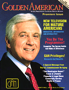
Client: Golden American Network (Cable TV for Mature America)
New Brand Identity for Cable Network, New On-Air logo. Additionally developed collateral, magazines, slide presentations, on-air titles, presentations for Season Rollouts, Cable Guides, Magazines, etc. | ||
| ||
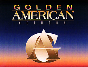
| Concept Development: Commissioned as the independent Creative and Design Director for The GOLDEN AMERICAN NETWORK, a new broadcast corporation. strategically create contemporary image with traditional familiarity. In this case, we were inspired by the of the old RKO radio tower -type image" and brought it into the present, replacing the shape of the old globe with the "G" and the old radio tower shape with the "A." The crossbar of the "G" overlaps the "A" to tie the elements together. Tony created the GOLDEN AMERICAN FILM Logo reinforcing an international corporate communication company image, also providing direct mail marketing consultation, collateral design experience and computer graphic design for their monthly magazine, image concept magazine advertising and media kits. He was the consultant of record, teaching in-house personnel in computer production of print collateral, from initial comps through Electronic Pre-press and press. He also managed prepress and press. Type Branding using font "American." Color palette and gamut developed that would translate cleanly from an RGB television monitor into CMYK print. Use of this Site signifies your agreement to Terms and Conditions. Site is the Intellectual Property and Copyright © 1996-2005 Todaro Communications, Inc. All rights reserved worldwide. All trademarks, trade names, service marks and logos referenced herein belong to their respective owners. |